June 24, 2025
We’ve improved the button element for the standard digital portal. You can now add a secondary button to navigate users to different pages without submitting data. Additionally, we’ve organized most portal elements into sub-sections to make it easier to navigate and find related elements (such as text, integrations, etc.). We’ve also released minor UI improvements and bug fixes.
Release Details
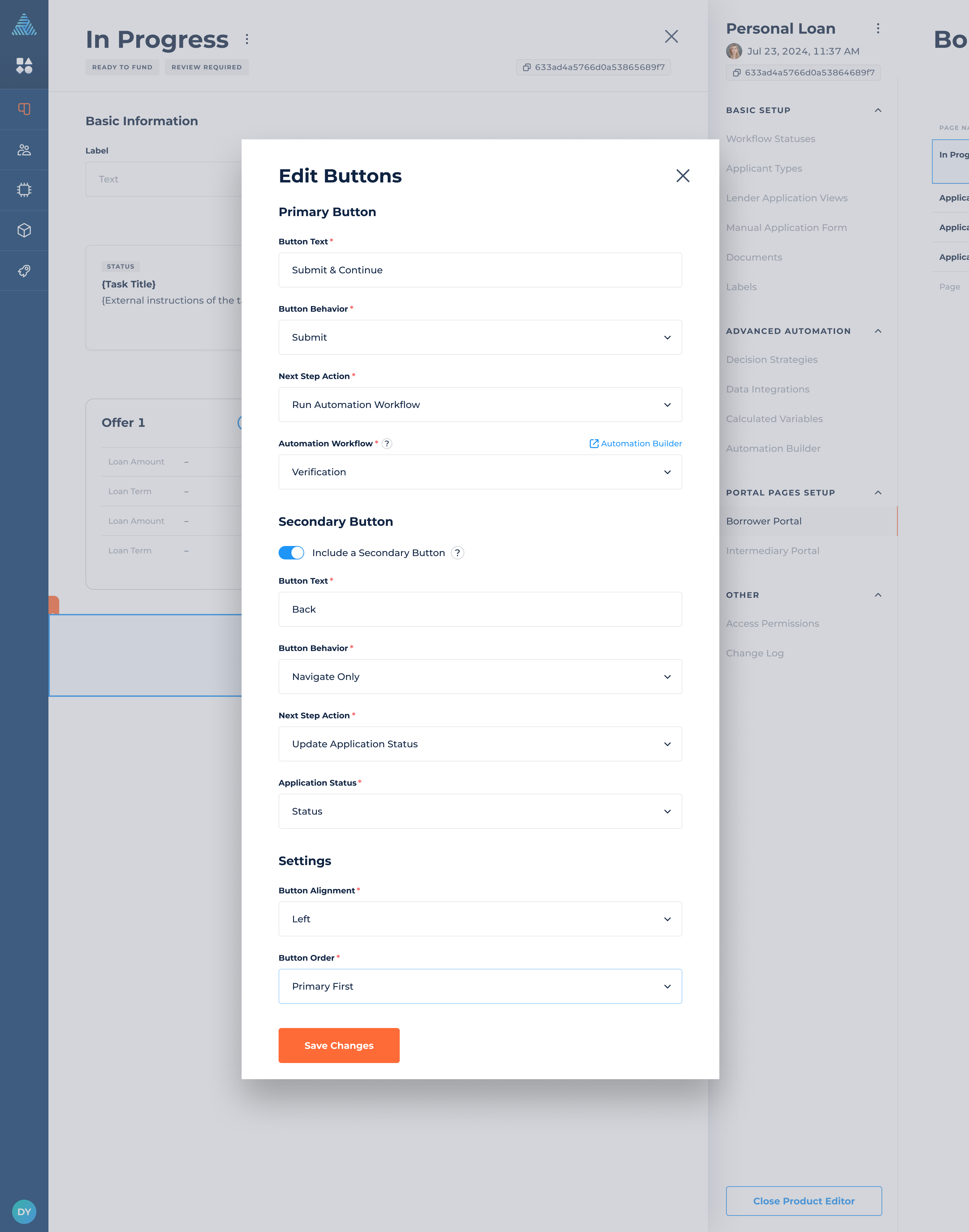
Improved Button Element
If you’re using a standard digital portal provided by DigiFi, this update is for you. The button element now includes the following improvements:
- Ability to add multiple button elements on a single portal page.
- Option to toggle on a secondary button within a button element, alongside the primary button.
- New Button Behavior setting that lets you choose whether the button will submit data or navigate to a different page.
- Ability to define the Next Step Action after the button is clicked, selecting either Run Automation Workflow or Update Application Status.
- New Button Alignment setting: Justify.
- A setting for button order, available when the secondary button is enabled. You can choose whether the primary or secondary button appears first.
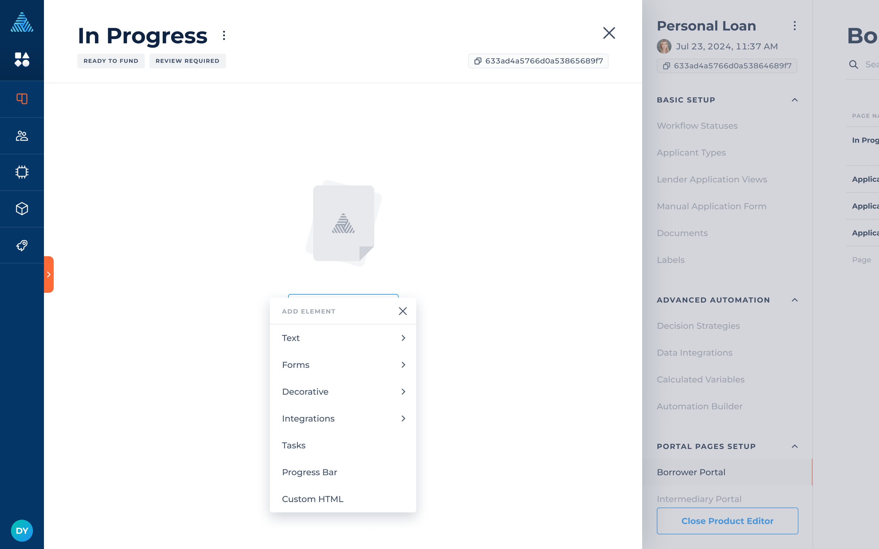
Organized Portal Elements
To make portal elements more organized and easier to navigate as their number grows, several sub-sections have been created to group related elements:
- Text: Header Text, Sub-Header Text, Body Text, Text Columns
- Forms: Data Input, Buttons, Slider, Selection Options, Offer Selection
- Decorative: Image, Page Divider
- Integrations: Plaid Link, E-Signature
Elements such as Tasks, Progress Bar, and Custom HTML remain available outside of these sub-sections.