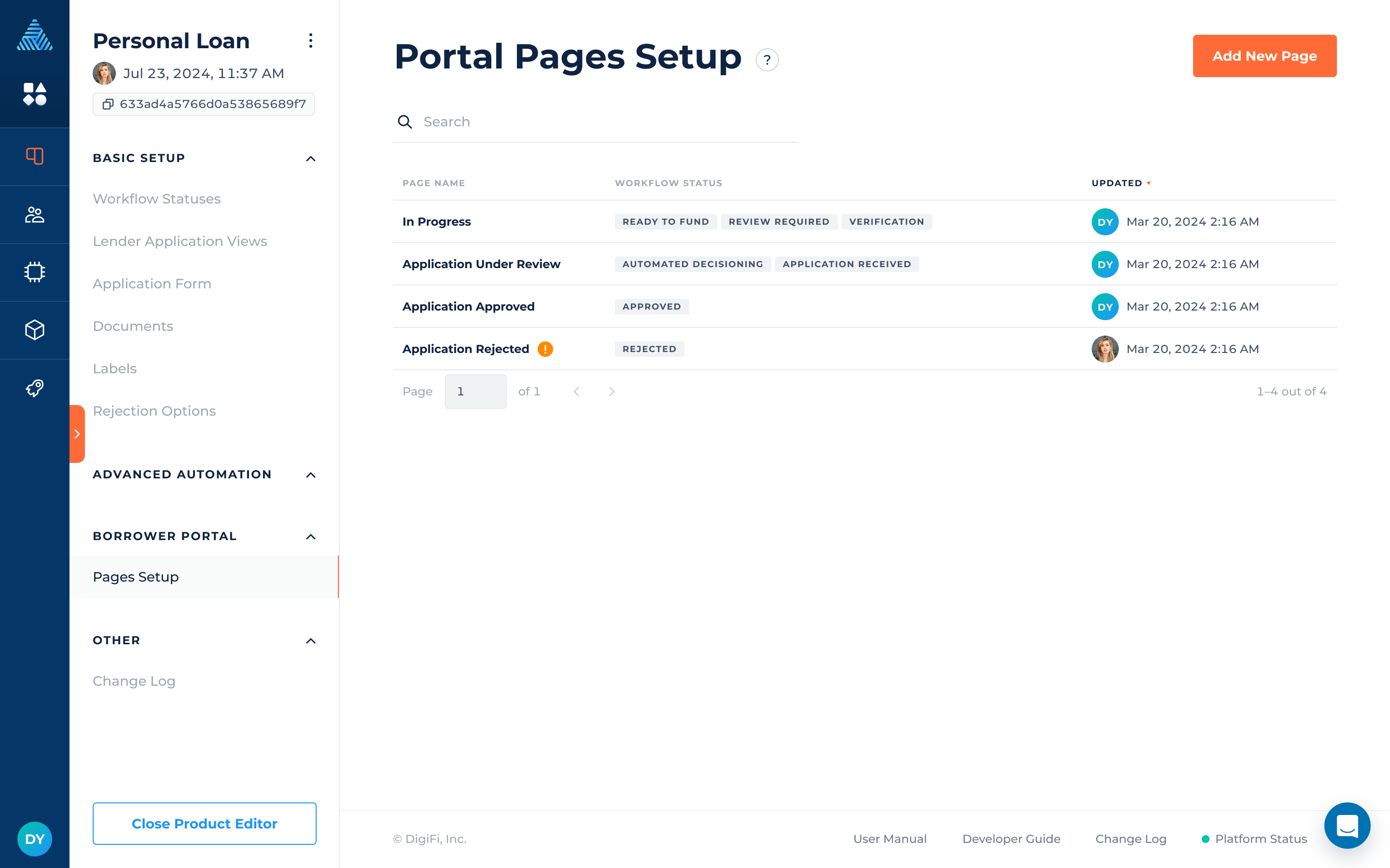
Pages Setup
Create unique experience for your borrowers on the Standard Borrower Portal.
Overview of Pages Setup
DigiFi provides a unique borrower experience with configurable and interactive pages. You can configure each step of the application process on the client's side by adding elements to portal pages, such as loan offers, tasks, and more.
Each page you create will let you:
- Specify the title of the page, which highlights the particular stage in the loan process it signifies.
- Link one or more workflow statuses to the page, facilitating a smooth transition through each phase.
- Incorporate various elements and effortlessly change their order using the drag-and-drop feature.
You can create multiple pages and associate them with various statuses, enabling you to build a modern intuitive experience tailored to your borrower's needs!
How To Add A Page
To add a page:
- Navigate to the "Pages Setup" in the "Borrower Portal" section.
- Click on "Add New Page."
- Provide the page name.
- Assign workflow status(es) to the page.
After you have created the page, you can begin adding elements to it.
How To Add Elements To A Page
To add an element to a page:
- Click on the "Add First Element" button or click on the "+" button located between the elements.
- Select an element from the dropdown list.
- Hover over the upper-right corner of the element.
- Click on the pen icon to edit the element's configurations.
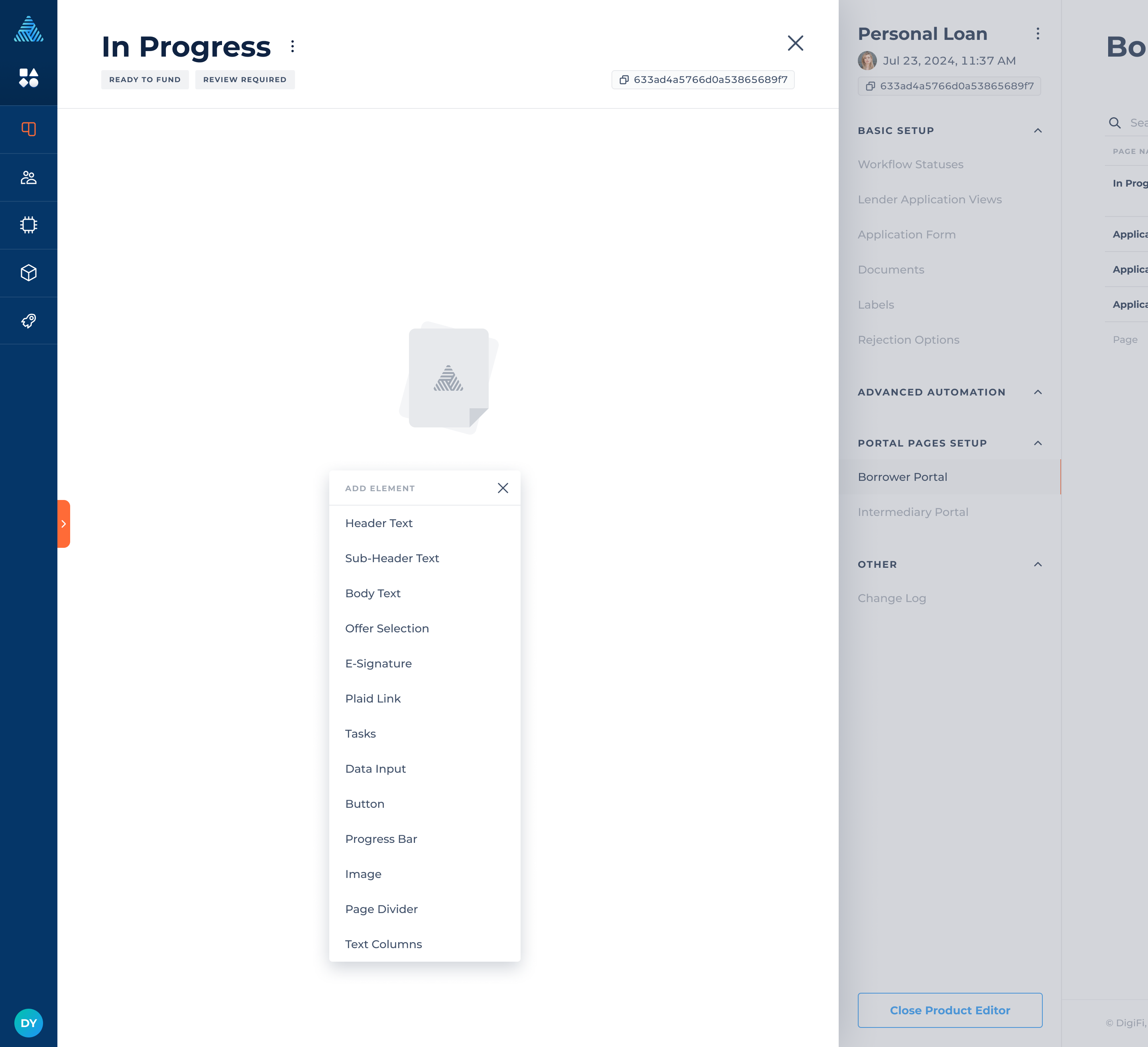
Page Elements
Elements are the fundamental components of a portal's page, and they can be tailored for each stage in the loan process. Below is a description of each element available in the Pages Setup.
| Element | Description |
|---|---|
| Header Text | Lets you incorporate the main title of the page on the portal to inform borrowers about the exact step of the loan process they’re on. |
| Sub-Header Text | Lets you incorporate the secondary title of the page on the portal to provide borrowers with additional details about the specific step of the loan process they're currently on. |
| Body Text | Lets you include the main content or provide information for borrowers on the portal page. |
| Offer Selection | Lets you include a table of loan offers for borrowers to select on the portal page. |
| Tasks | Lets you include tasks for the borrowers to upload documents and leave comments. |
| Data Input | Lets you create forms with variables to request information from the borrower on the portal. |
| Button | Lets you to include buttons on the portal page for submitting completed tasks, data inputs, and selected loan offers. |
| Image | Lets you incorporate images on the portal to visually represent your company or loan product. |
| Page Divider | Lets you incorporate page dividers on the portal, which help separate elements and create a more cohesive layout. |
| Progress Bar | Lets you incorporate a progress bar, which helps borrowers track the progress of their loan application and the number of steps in the process. |
| E-Signature | Lets you present documents to borrowers for secure signing directly within the portal, enabling them to complete the loan process faster. |
| Plaid Link | Lets you incorporate a widget that allows borrowers to securely connect their financial accounts directly from your portal. |
| Text Columns | Lets you present additional information in the form of columns of text (either bulleted or non-bulleted). |
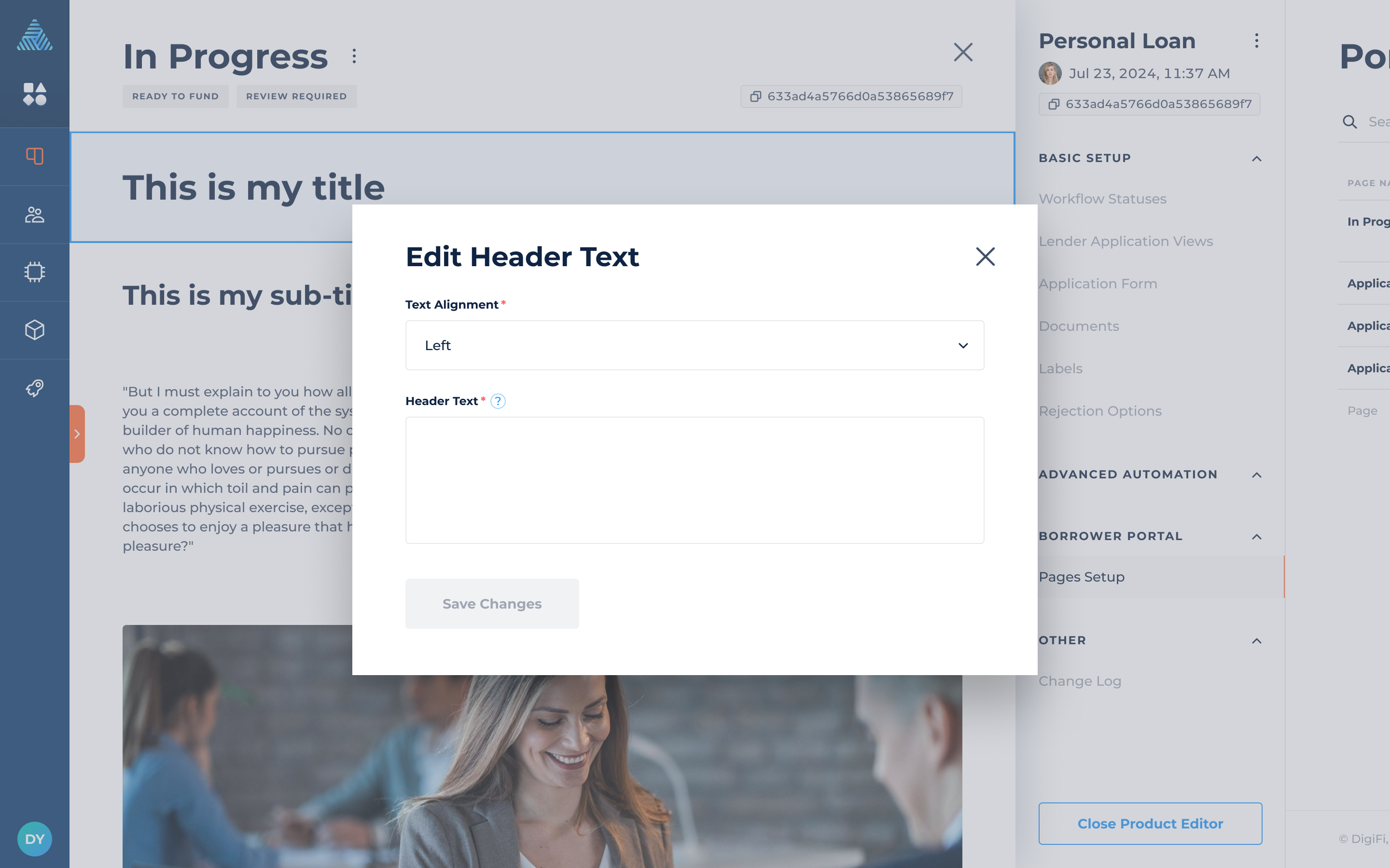
Header Text
The header text element can both emphasize the page title to the borrower and attract the borrower's attention towards specific information at the top of the page.
Headers include the following configurations:
- Text Alignment (Left, Center, Right), which lets you choose the placement of the text.
- Header Text, which represents the text in the header.
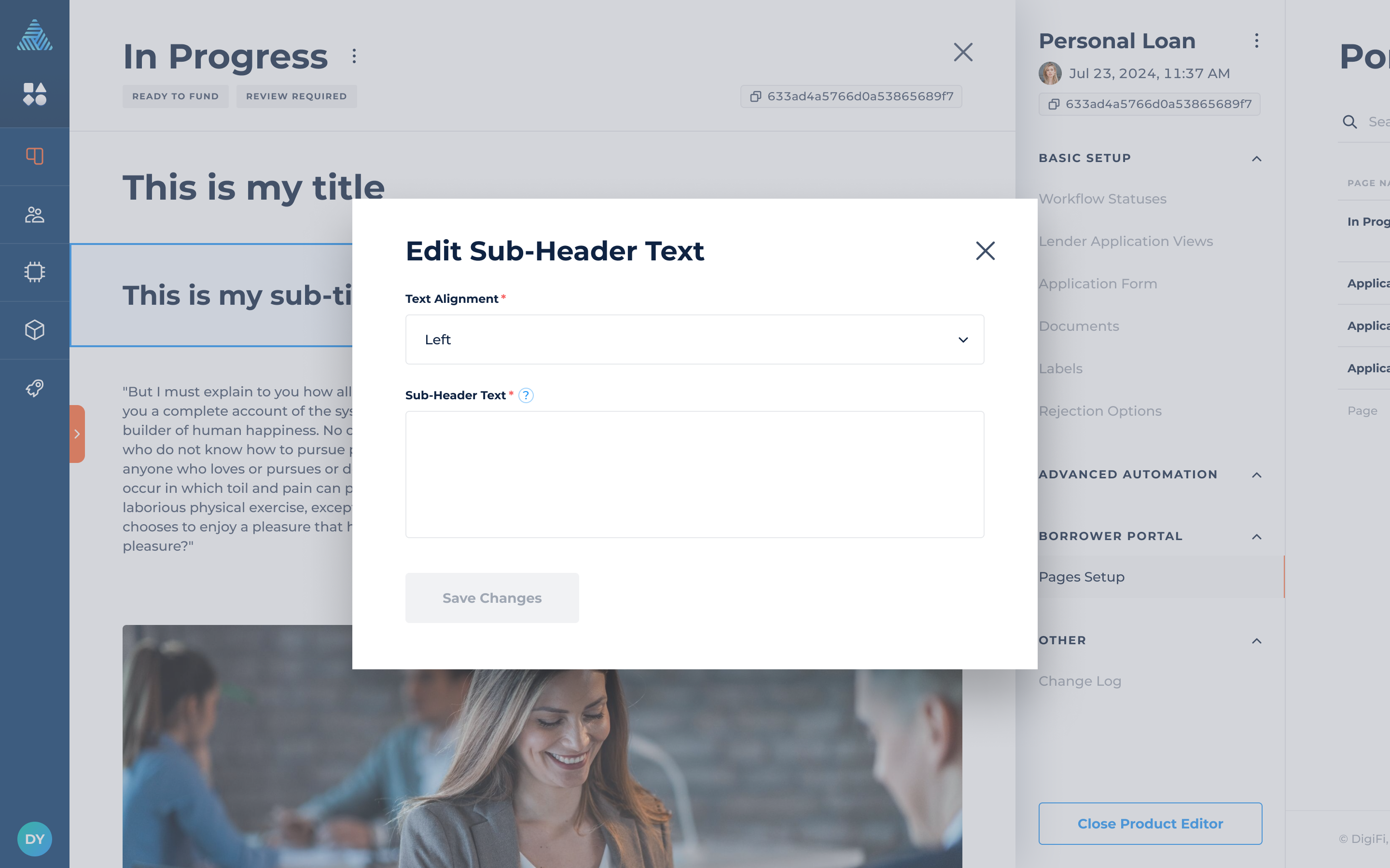
Sub-Header Text
The sub-header text element can help you organize content into sections and subsections, as well as focus on a specific topic.
Sub-headers include the following configurations:
- Text Alignment (Left, Center, Right), which lets you choose the placement of the text.
- Sub-Header Text, which represents the text in the sub-header.
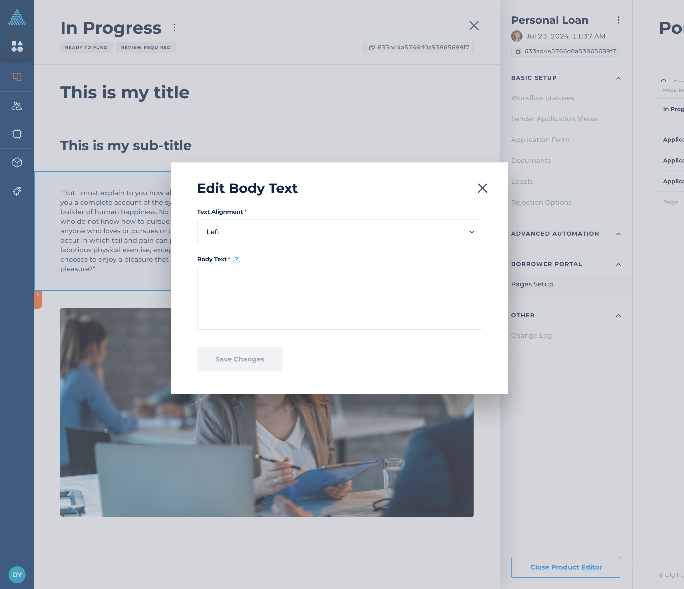
Body Text
The main body text provides essential information or detailed instructions for the borrower on the page.
The body includes the following configurations:
- Text Alignment (Left, Center, Right), which lets you choose the placement of the text.
- Body Text, which represents the text in the body.
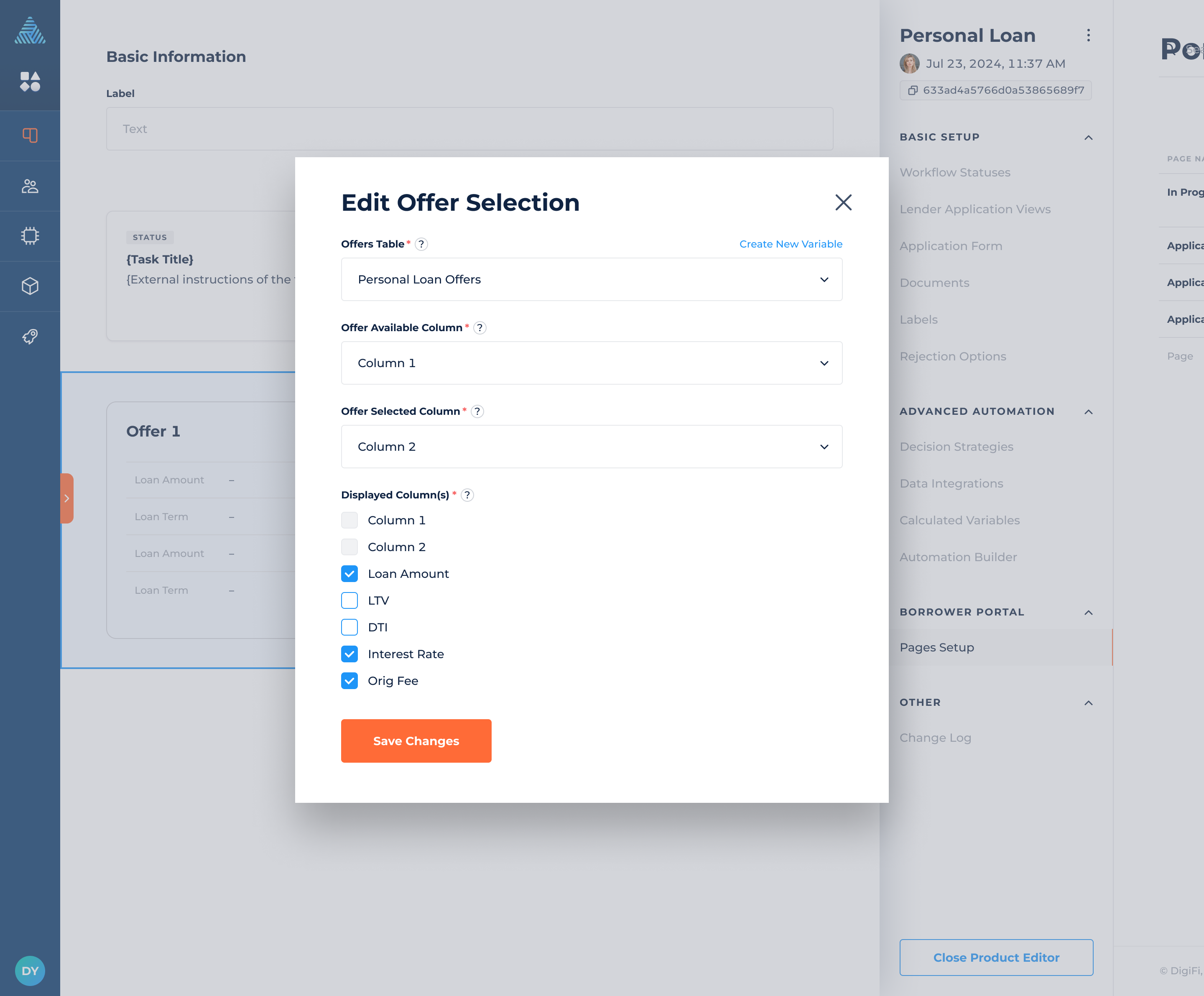
Offer Selection
The offer selection presents multiple loan options to your borrower, complete with detailed information for each proposal.
The offer selection includes the following configurations:
- Offers Table, which represents the table populated with loan offers.
- Offer Available Column, which represents the offers available to the borrower on the portal.
- Offer Selected Column, which represents the column where borrower's offer selection is recorded.
- Displayed Column(s), which represents the columns shown to the borrower on the portal.
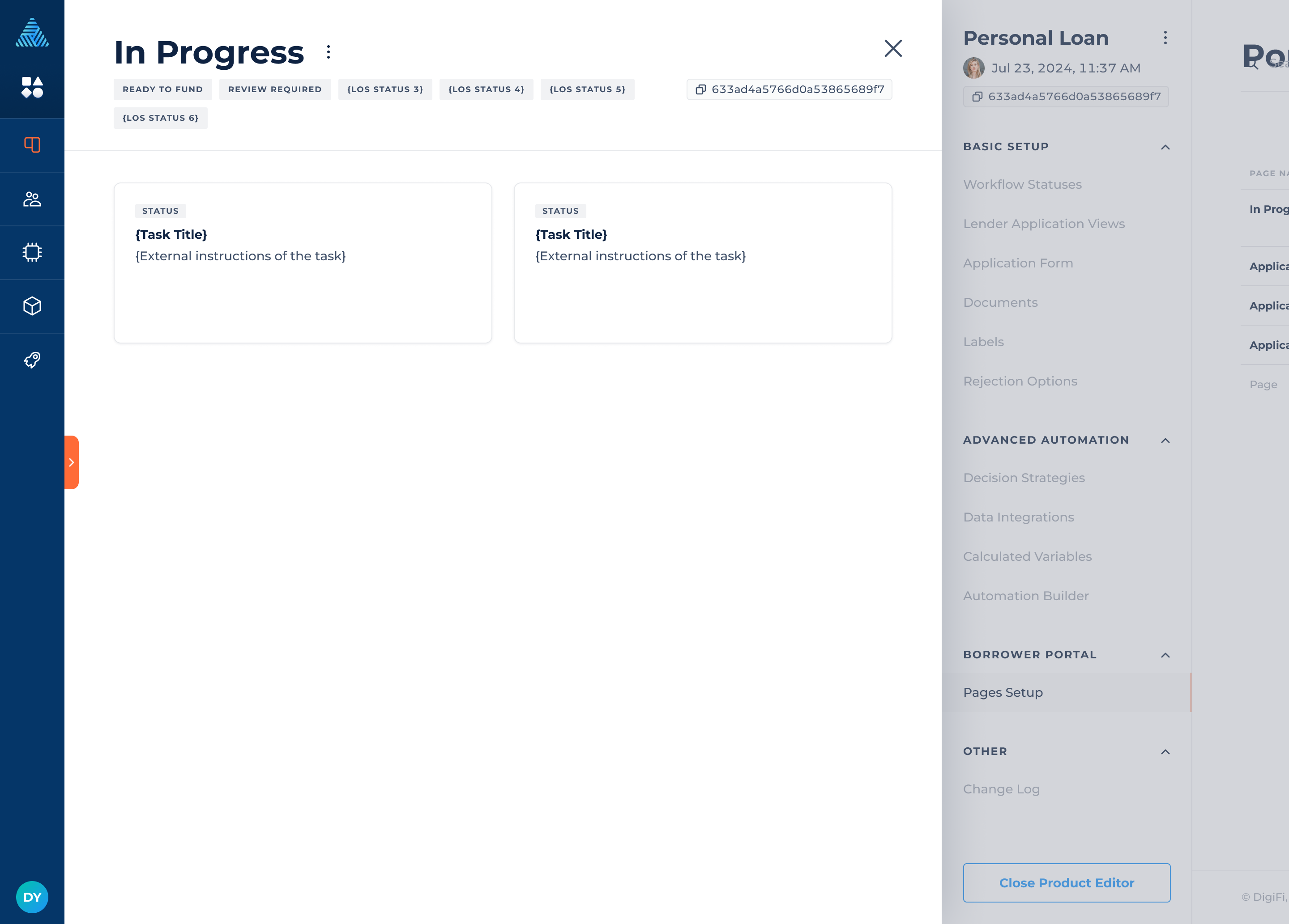
Tasks
The tasks provide detailed instructions for the borrower, along with a dedicated space for uploading necessary documents and posting comments.
Tasks are auto-populated from applications. They are configured independently, either through automations or manually.
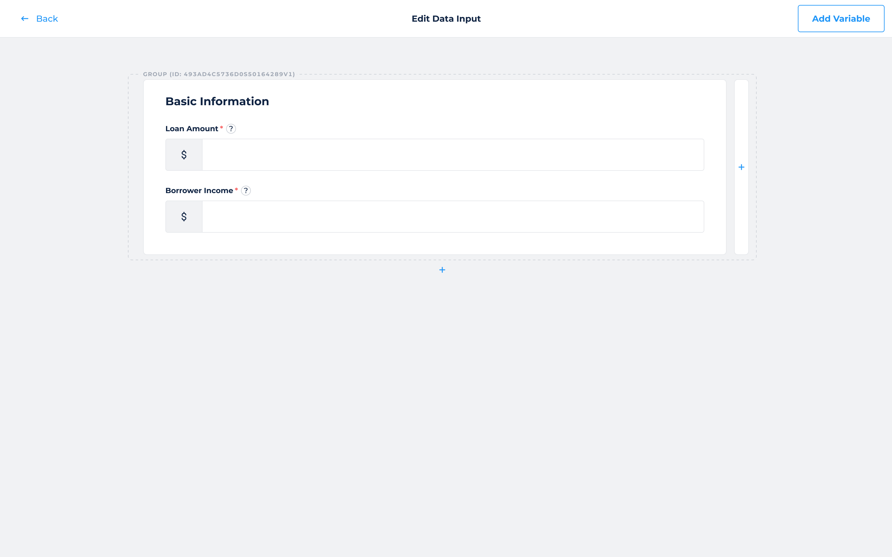
Data Input
The data inputs enable borrowers to share additional information by completing certain variables.
The data input function enables you to establish groups with sections, assign names to these sections, and utilize a drag-and-drop feature to add variables.
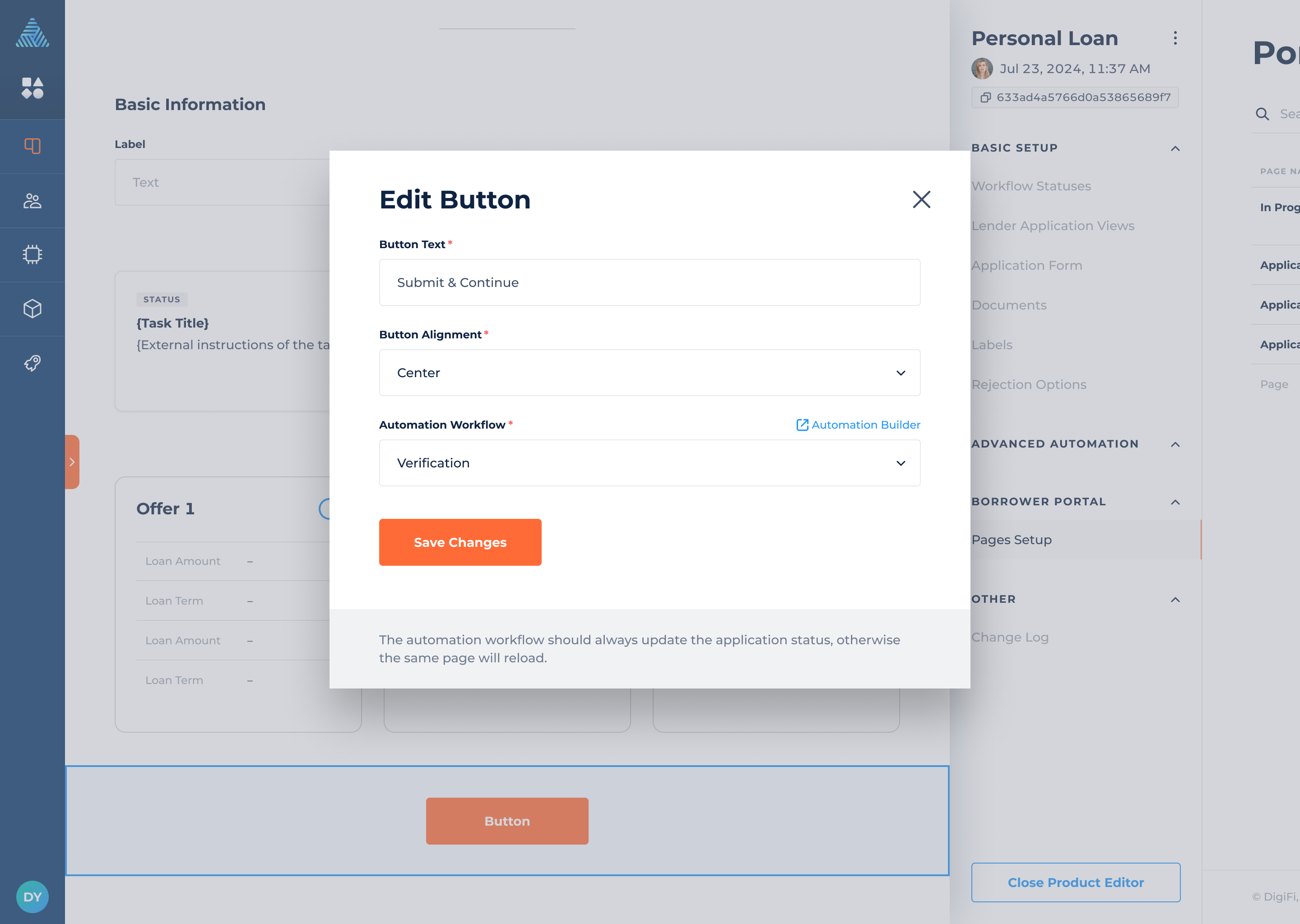
Button
The button facilitates borrowers in performing various actions such as choosing loan offers, accomplishing tasks, and providing necessary data inputs.
The button includes the following configurations:
- Button Text, which represents text within the button.
- Button Alignment (Left, Center, Right), which lets you choose the placement of the button.
- Automation Workflow, which lets you choose an automation linked to the button.
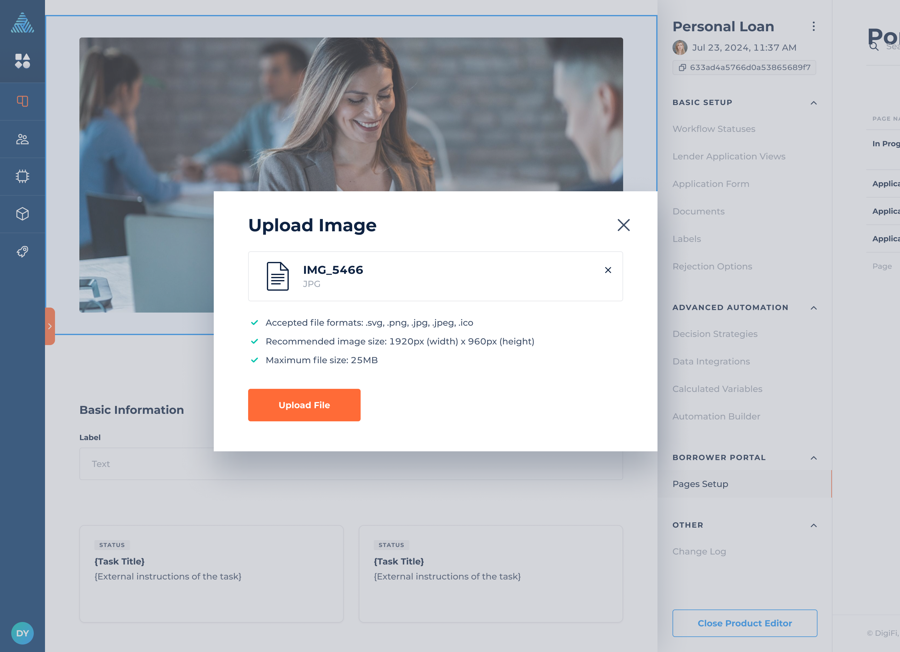
Image
The images help you to incorporate additional branding elements, making it not unique visually, but also tailored to suit your specific business and loan product.
You can specify the image you would like to add and its alignment.
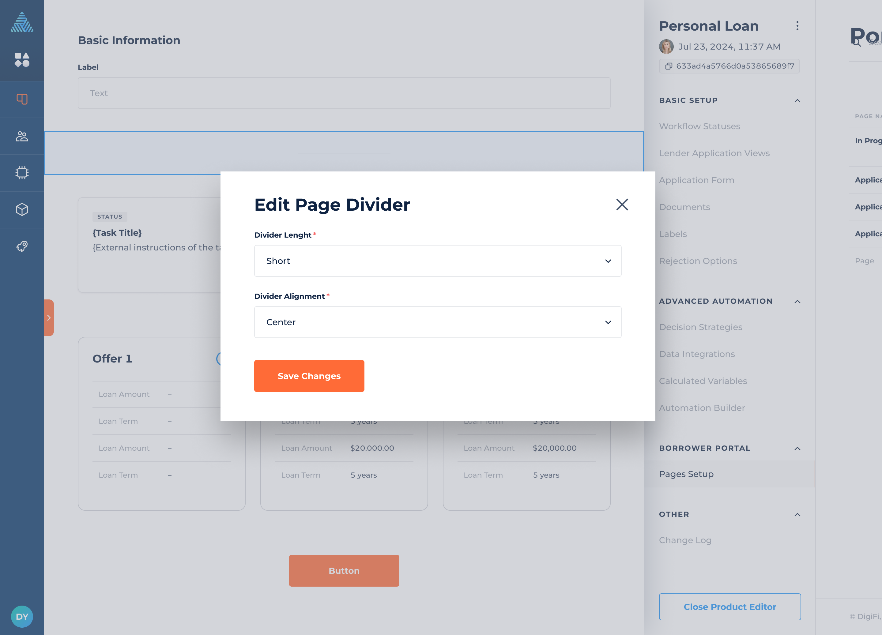
Page Divider
The page divider helps you organize content into distinct sections by creating visual breaks that separate different elements.
The page divider includes the following configurations:
- Divider Length, which lets you select the length of the page divider.
- Divider Alignment, which lets you choose the placement of the page divider.
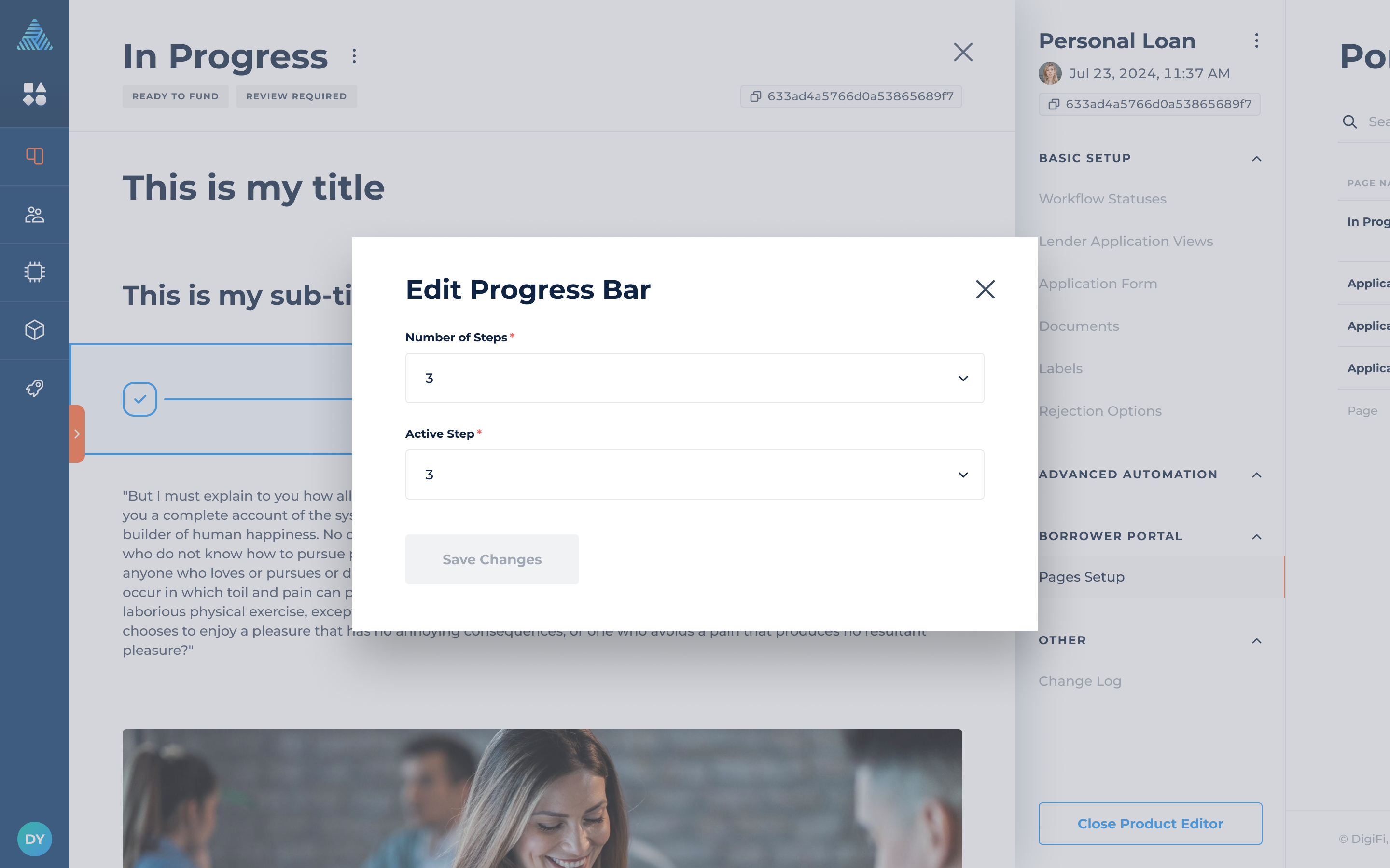
Progress Bar
The progress bar element can make the loan process more transparent for your borrower, showing them exactly what step they are at in the loan application. The progress bar can display a maximum of 15 steps.
The progress bars include the following configurations:
- Number of Steps, which indicates the total number of steps in the entire loan process.
- Active Step, which indicates the specific step the borrower is currently at.
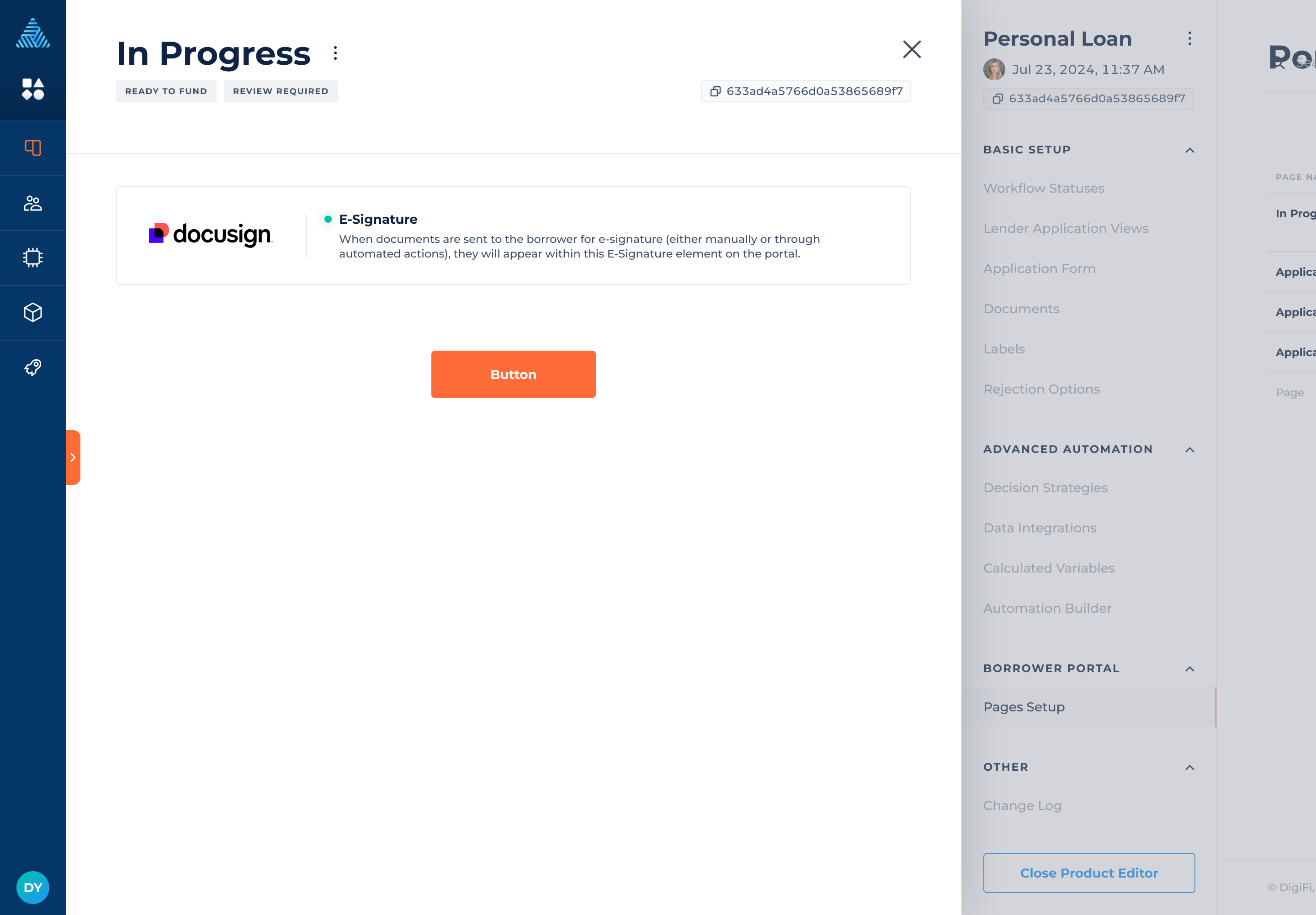
E-Signature
The e-signature element can be used if you have DocuSign connected through DigiFi. Once the element is added, any available documents for e-signature will be accessible on the borrower portal, allowing borrowers to sign and proceed with the process.
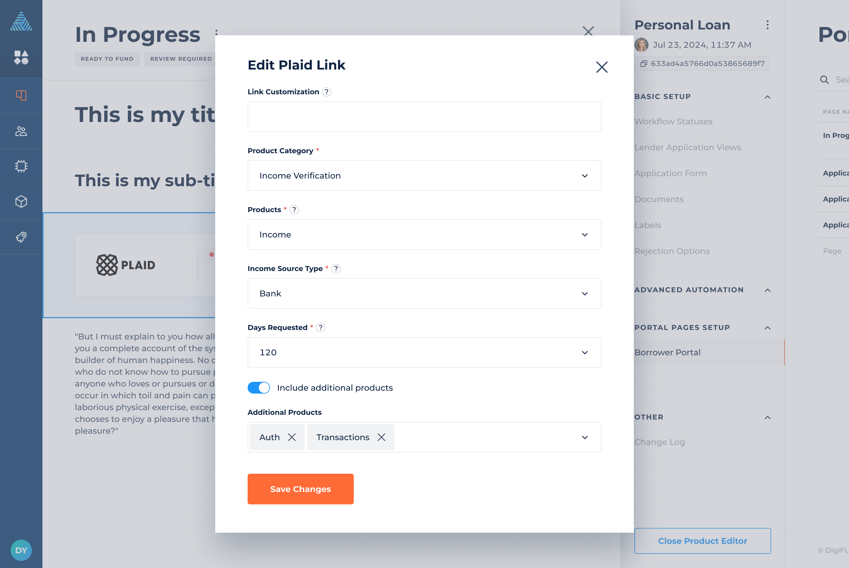
Plaid Link
The Plaid Link element can be used if you have Plaid Link connected through DigiFi. It works in conjunction with the Plaid integrations available in the marketplace.
The Plaid Link includes the following configurations:
-
Link Customization, which is the name of the Link customization from the Plaid dashboard. If the field left empty, default customization will be used.
-
Product Category, which lets you select the product category.
-
Product, which lets you select the applicable Plaid product(s).
- Income Source Type, which allows you to select the income source if the selected product is Income.
- Days Requested, which lets you select the number of days of data to request if the selected product is Income.
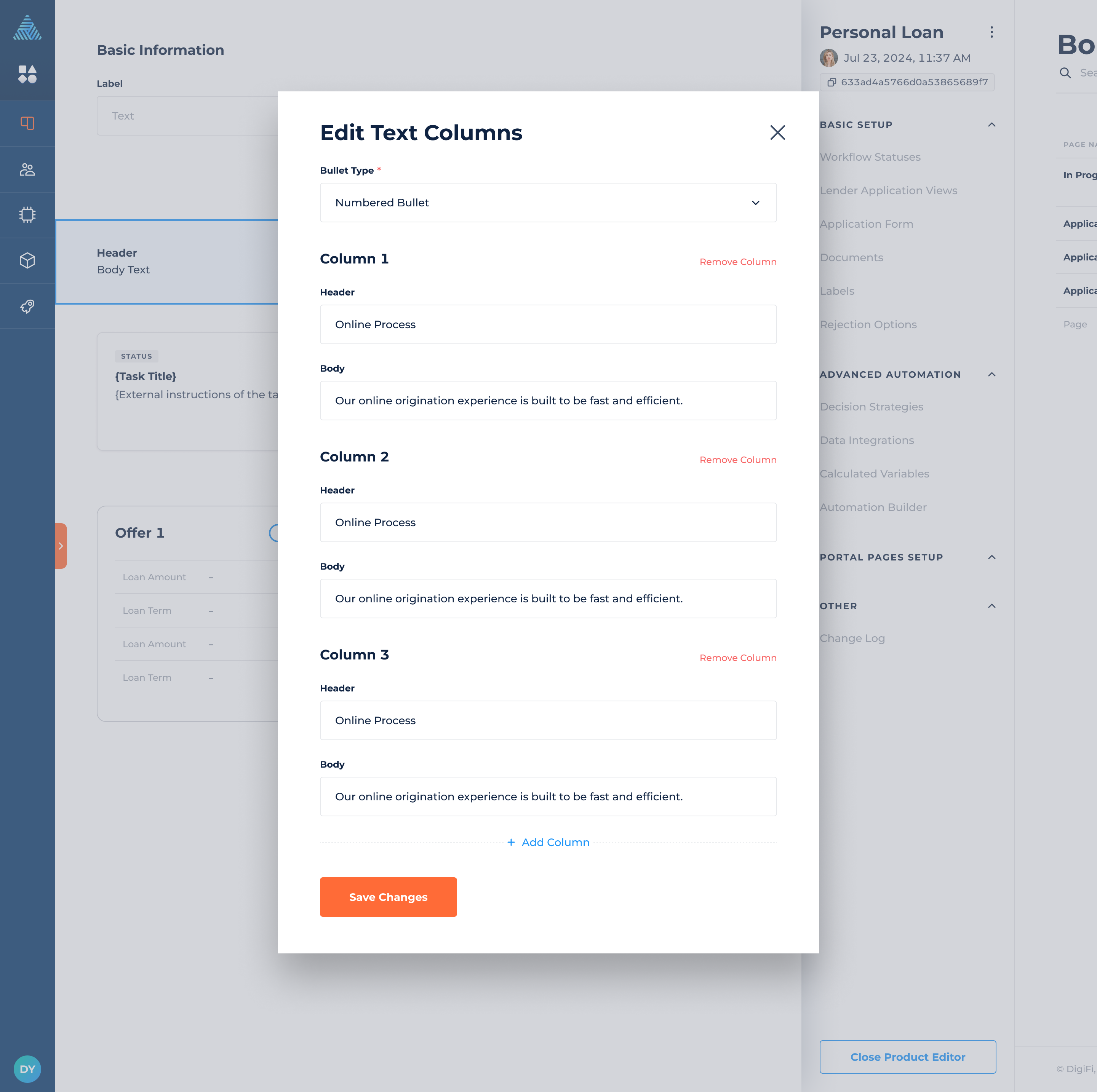
Text Columns
The Text Columns are customizable fields where users can input and display textual information related to loans, borrowers or other relevant data. The maximum number of text columns allowed is 5.
The text columns include the following configurations:
- Bullet Type, which allows you to select the type of bullet (or no bullet) to display with text columns.
- Header, which is the main title or heading of the column.
- Body, which is the main content or paragraph of the column.
How to Duplicate Elements
To duplicate an element:
- Hover over the upper-right corner of the element.
- Click on the "duplicate" icon.
How to Delete Elements
To delete an element:
- Hover over the upper-right corner of the element.
- Click on the "delete" icon.
Updated 28 days ago