Appearance
How to configure the appearance of the portal and it's landing page.
Overview of Portal Appearance
The borrower portal includes the ability to customize it's appearance, to showcase your brand identity and key business information.
- Reflect your brand by incorporating your brand colors and logos into the portal.
- Add custom CSS to further refine your portal's branding and personalization.
- Add a custom HTML footer to match your other digital assets.
- Customize the portal's landing page.
Branding
DigiFi allows you to customize the appearance and language of your borrower portal. This is done through the Branding section, where you can select a customer-facing language and incorporate your company’s colors and logo. These customizations will also be reflected in the automatic emails sent to borrowers and intermediaries.
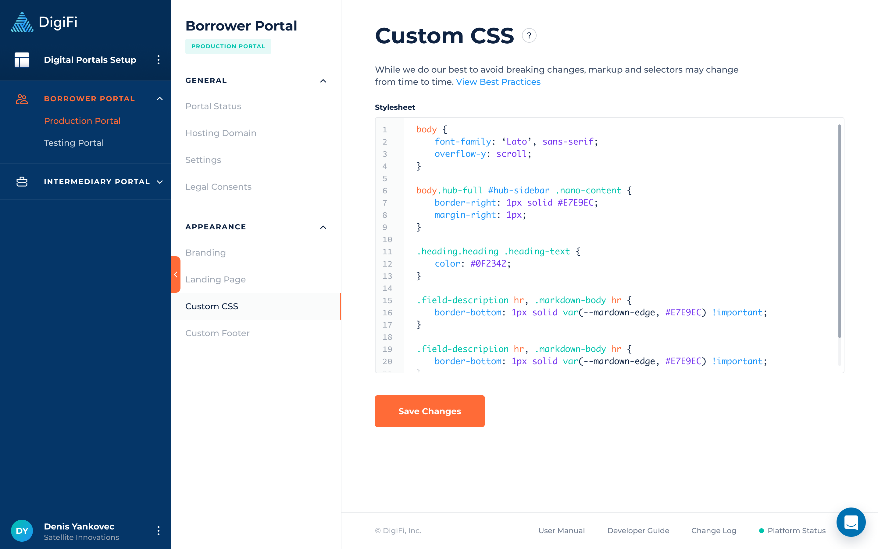
Custom CSS
Make your lending portal more structured and visually appealing by adding custom CSS. For example, use it to change the portal's background color, set a different default font, or style specific elements to match your branding.
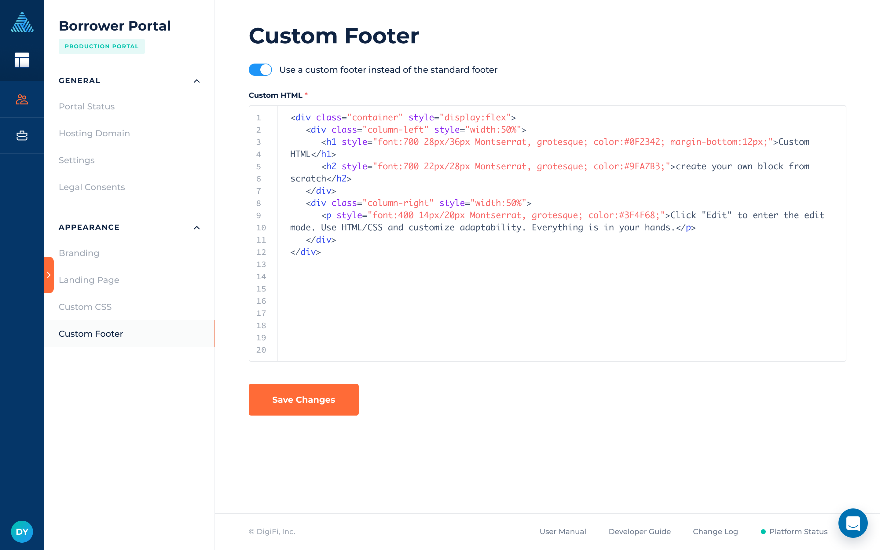
Custom Footer
If the standard portal footer doesn’t suit your needs, enable the custom footer to add and manage custom HTML content and styles. This allows you to create a footer that is both visually appealing and informative. The custom footer will appear on all portal pages, providing enhanced branding and greater flexibility.
Custom Landing Page
DigiFi provides the ability to customize and build the landing page using page elements, similar to those used for other portal pages.
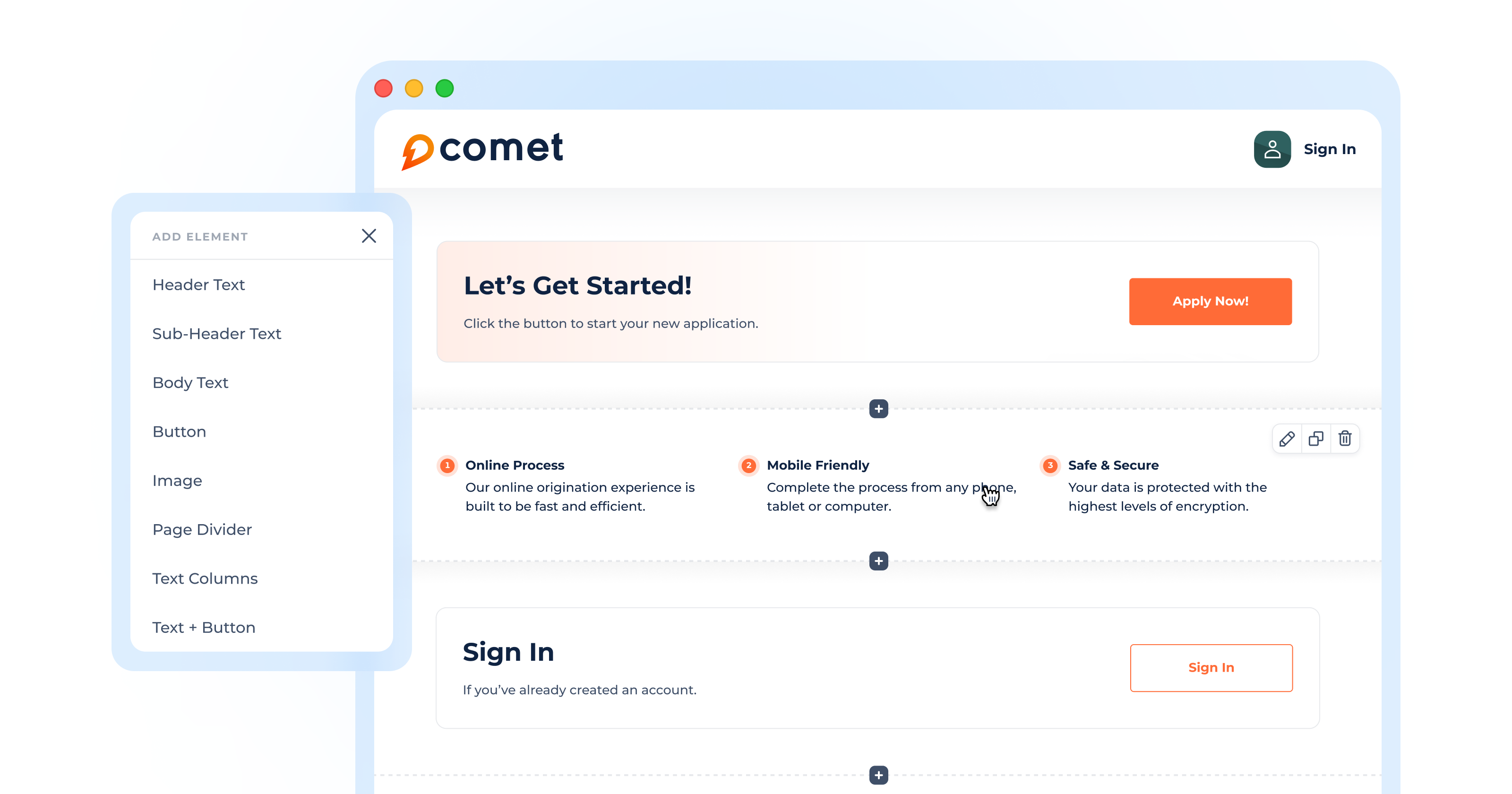
How To Add Elements
To add an element to a page:
- Click on the "Add First Element" button or click on the "+" button located between the elements.
- Select an element from the dropdown list.
- Hover over the upper-right corner of the element.
- Click on the pen icon to edit the element's configurations.
Element Details
Elements are the fundamental components of the landing page. Below is a description of each element available in the landing page setup.
| Element | Description |
|---|---|
| Heading 1 | Lets you incorporate the main title of the landing page to guide borrowers through their next action. |
| Heading 2 | Lets you incorporate the secondary title of the landing page on the portal to provide borrowers with additional details. |
| Heading 3 | Lets you organize the content into subsections and provides a clear structure for borrowers to follow on the landing page. |
| Heading 4 | Lets you include finer details or sub-subsections on the page, making content more organized and scannable on the landing page. |
| Body Text | Lets you include the main content or provide information for borrowers on the landing page. |
| Button | Lets you include a button on the landing page for applying for a loan, signing in, signing up, or performing other required actions. |
| Image | Lets you incorporate images on the portal to visually represent your company or loan product. |
| Page Divider | Lets you incorporate page dividers on the portal, which help separate elements and create a more cohesive layout. |
| Text Columns | Lets you present additional information in the form of text columns, either bulleted or non-bulleted. |
| Text + Button | Lets you include a button with accompanying text in a block that calls for action. |
| Custom HTML | Lets you add custom HTML blocks to portal pages, creating unique, tailored content that goes beyond the standard elements. |
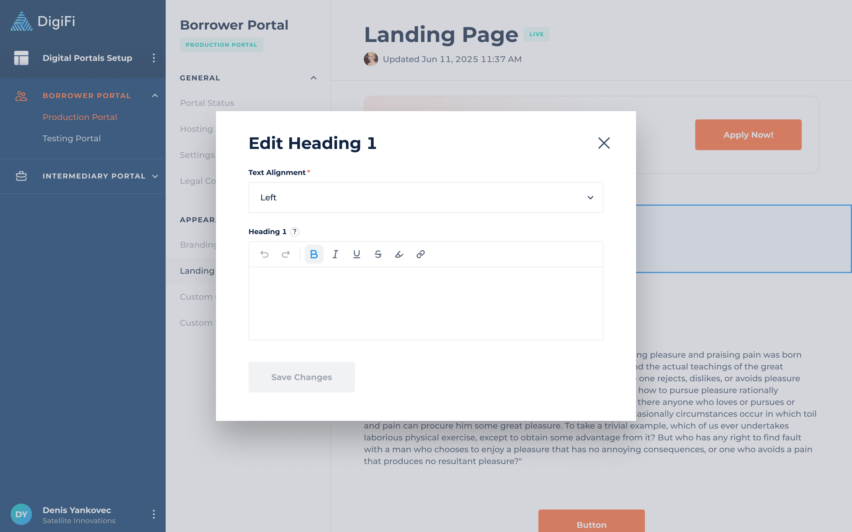
Heading 1
The heading 1 element can both emphasize the page title to the borrower and attract the borrower's attention towards specific information at the top of the page.
Heading 1 includes the following configurations:
- Text Alignment (Left, Center, Right), which lets you choose the placement of the text.
- Heading 1, which represents the heading text. By default, Heading 1 is bold, but you can remove the formatting and customize it using the editor.
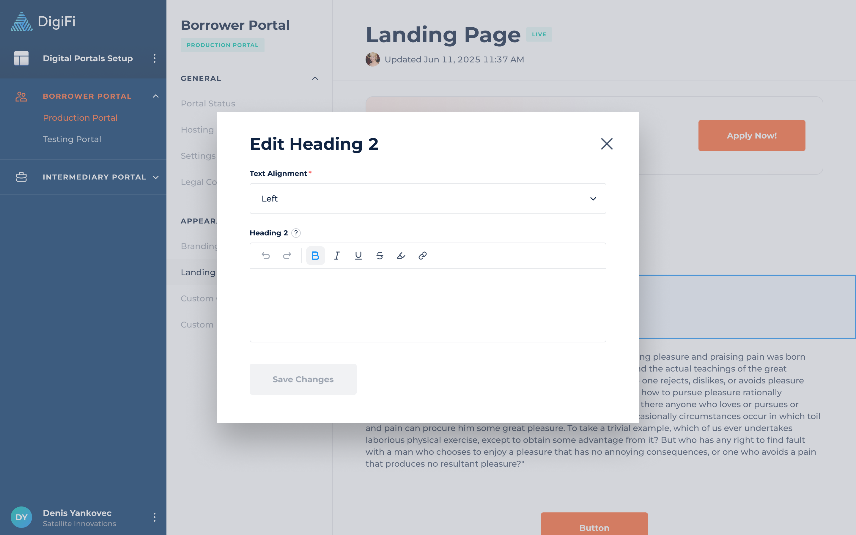
Heading 2
The heading 2 element can help you organize content into sections, as well as focus on a specific topic.
Heading 2 includes the following configurations:
- Text Alignment (Left, Center, Right), which lets you choose the placement of the text.
- Heading 2, which represents the heading text. By default, Heading 2 is bold, but you can remove the formatting and customize it using the editor.
Heading 3
The heading 3 element can help you organize the content into subsections and provide a clear structure for borrowers on the landing page.
Heading 3 includes the following configurations:
- Text Alignment (Left, Center, Right), which lets you choose the placement of the text.
- Heading 3, which represents the heading text. By default, Heading 3 is bold, but you can remove the formatting and customize it using the editor.

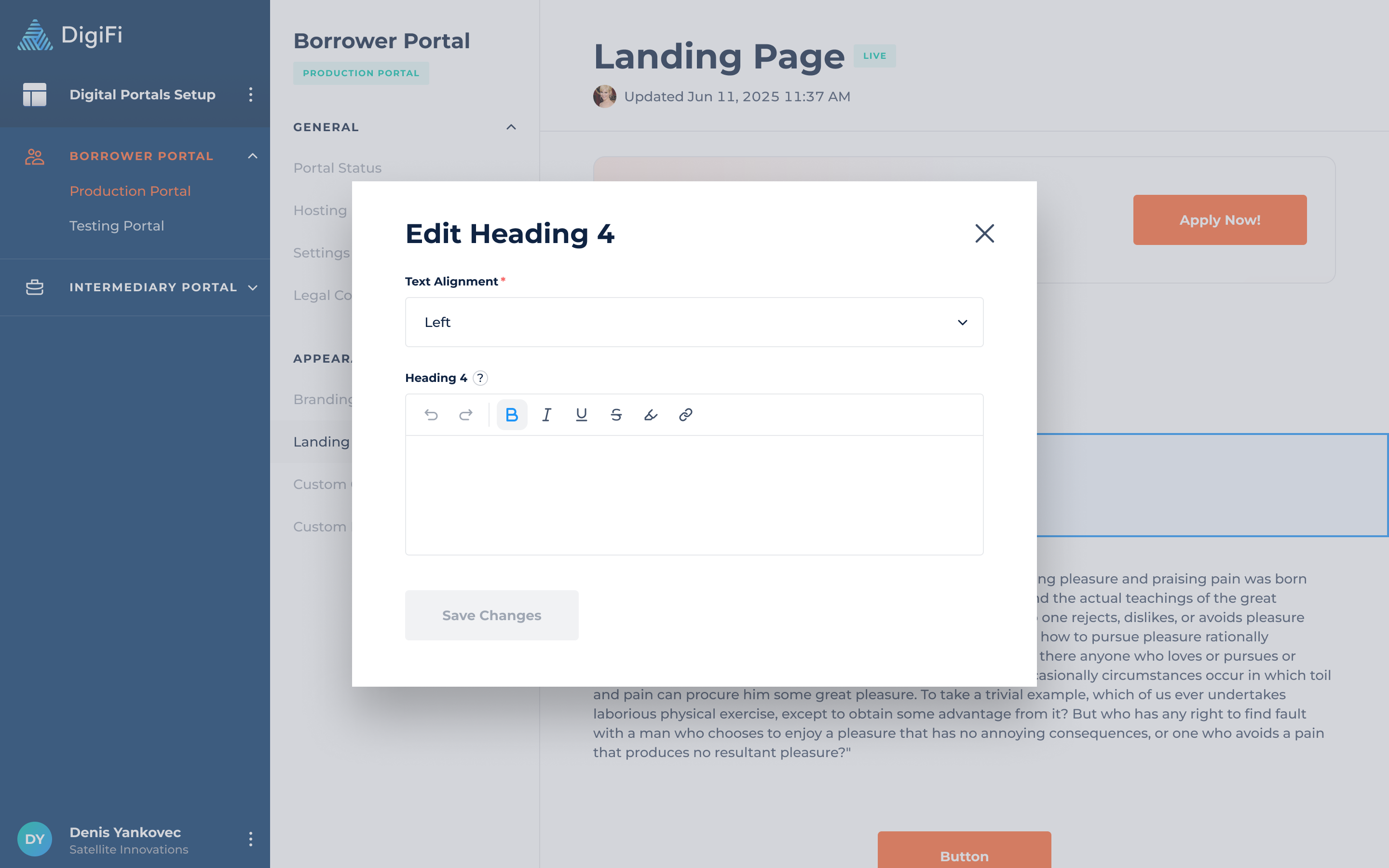
Heading 4
The heading 4 element can help you include finer details or sub-subsections for the borrowers on the landing page.
Heading 4 includes the following configurations:
- Text Alignment (Left, Center, Right), which lets you choose the placement of the text.
- Heading 4, which represents the heading text. By default, Heading 4 is bold, but you can remove the formatting and customize it using the editor.
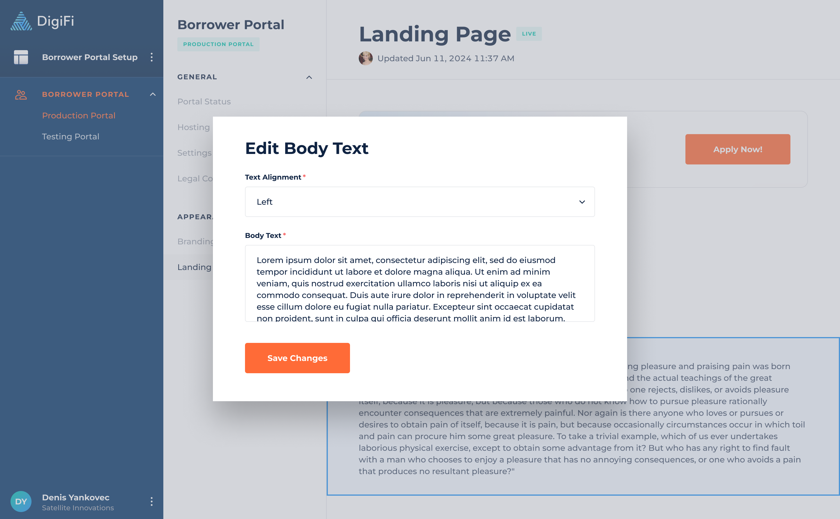
Body Text
The main body text provides essential information or detailed instructions for the borrower on the landing page.
The body includes the following configurations:
- Text Alignment (Left, Center, Right), which lets you choose the placement of the text.
- Body Text, which represents the text in the body.
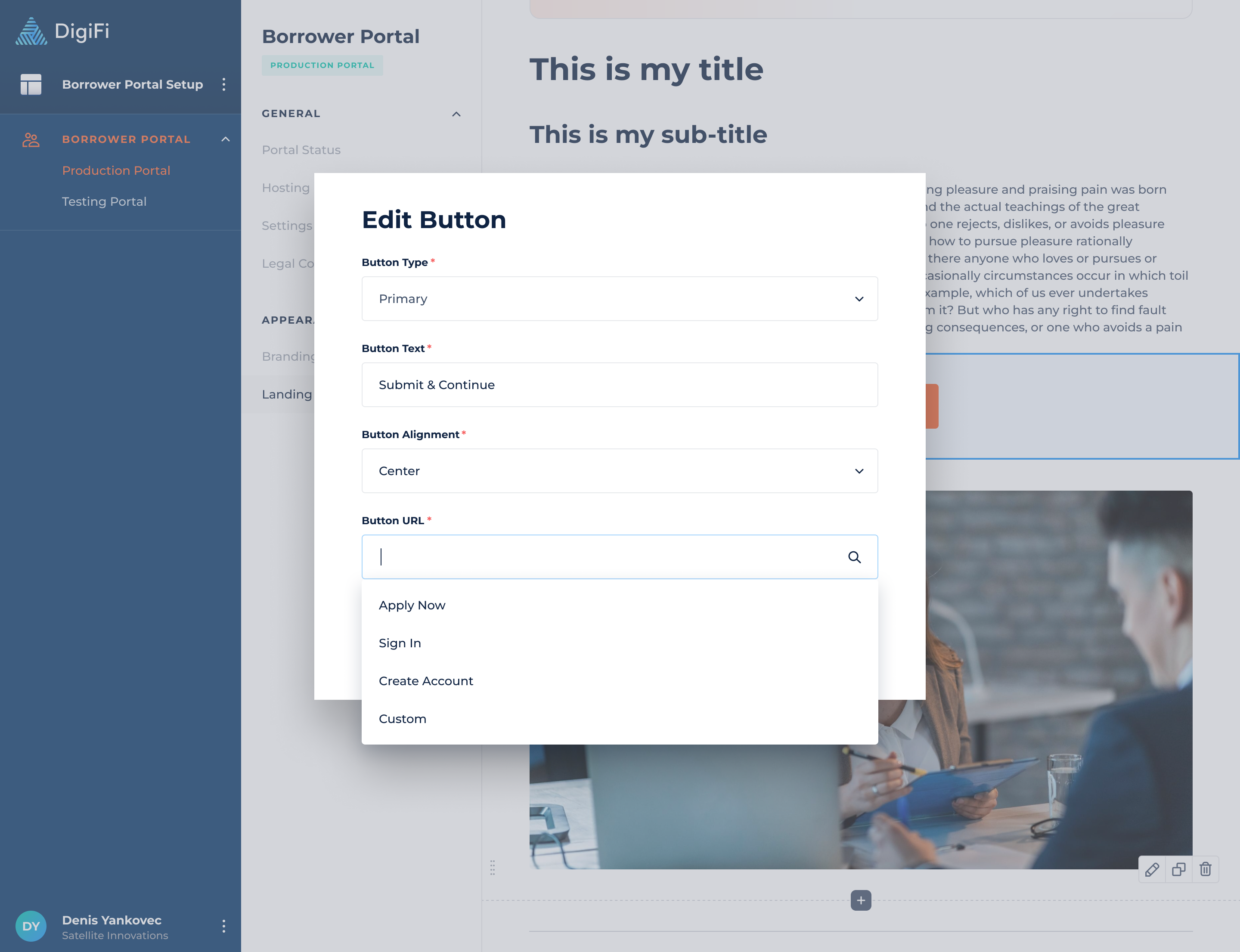
Button
The button helps link borrowers to various actions, such as applying for a loan, signing in, signing up, or completing other required actions.
The button includes the following configurations:
- Button Type (Primary, Secondary), which defines the visual style of the button on the landing page.
- Button Text, which represents text within the button.
- Button Alignment (Left, Center, Right), which lets you choose the placement of the button.
- Button URL (Apply Now, Sign In, Create Account, Custom), which allows you to define where the borrower will be redirected after clicking the button.
- Custom URL, if selected, allows you to specify the URL to which the borrower will be redirected.
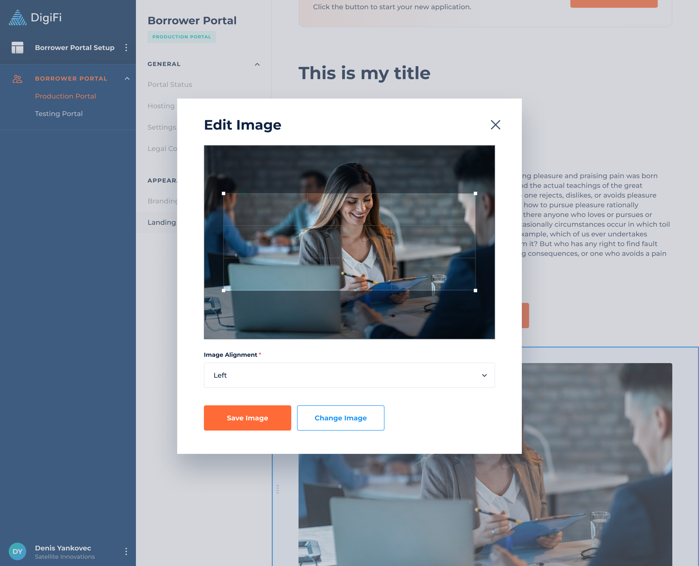
Image
The images help you to incorporate additional branding elements, making it not unique visually, but also tailored to suit your specific business and loan product.
You can specify the image you would like to add and its alignment.
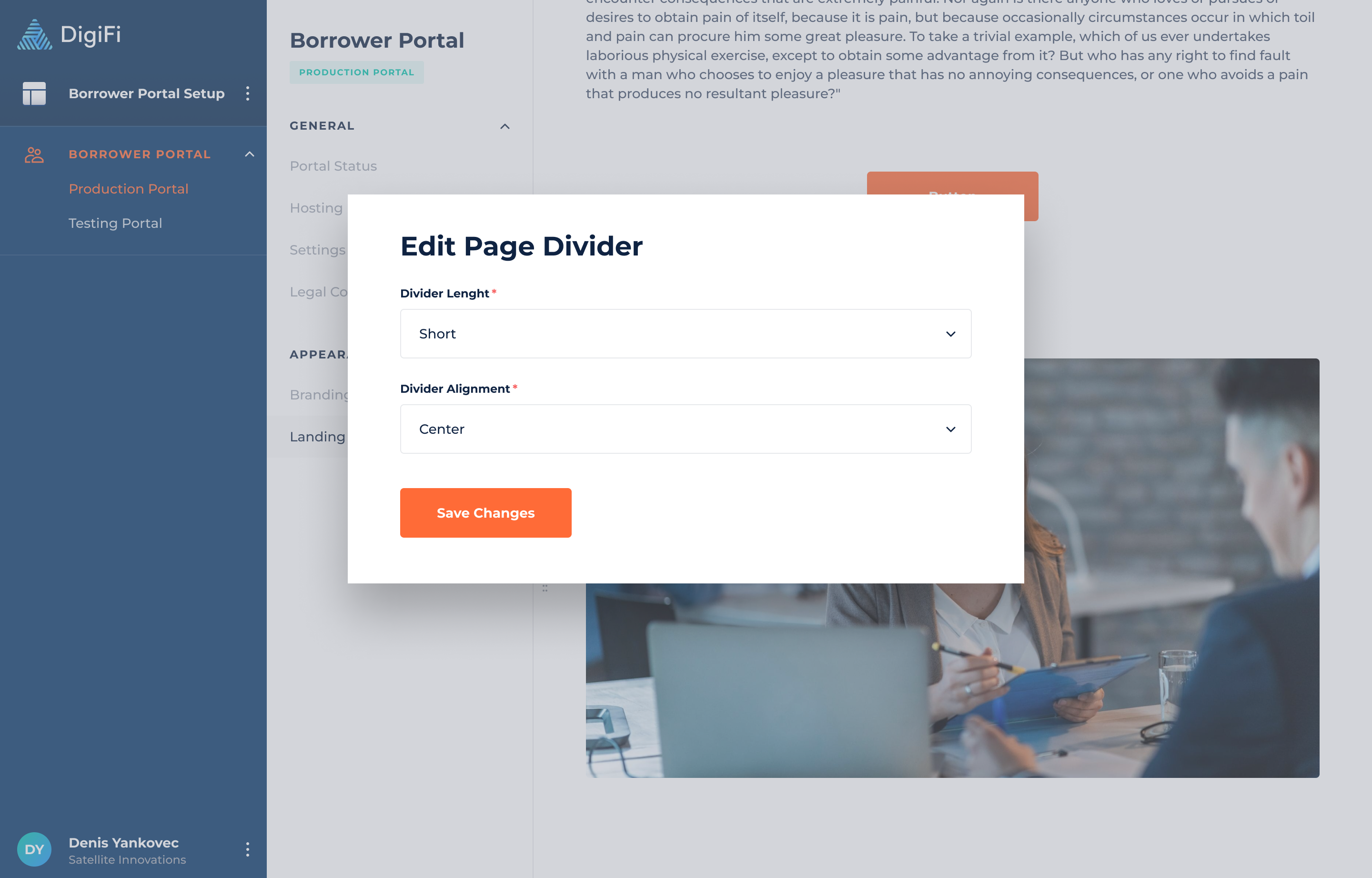
Page Divider
The page divider helps you organize content into distinct sections by creating visual breaks that separate different elements.
The page divider includes the following configurations:
- Divider Length, which lets you select the length of the page divider.
- Divider Alignment, which lets you choose the placement of the page divider.
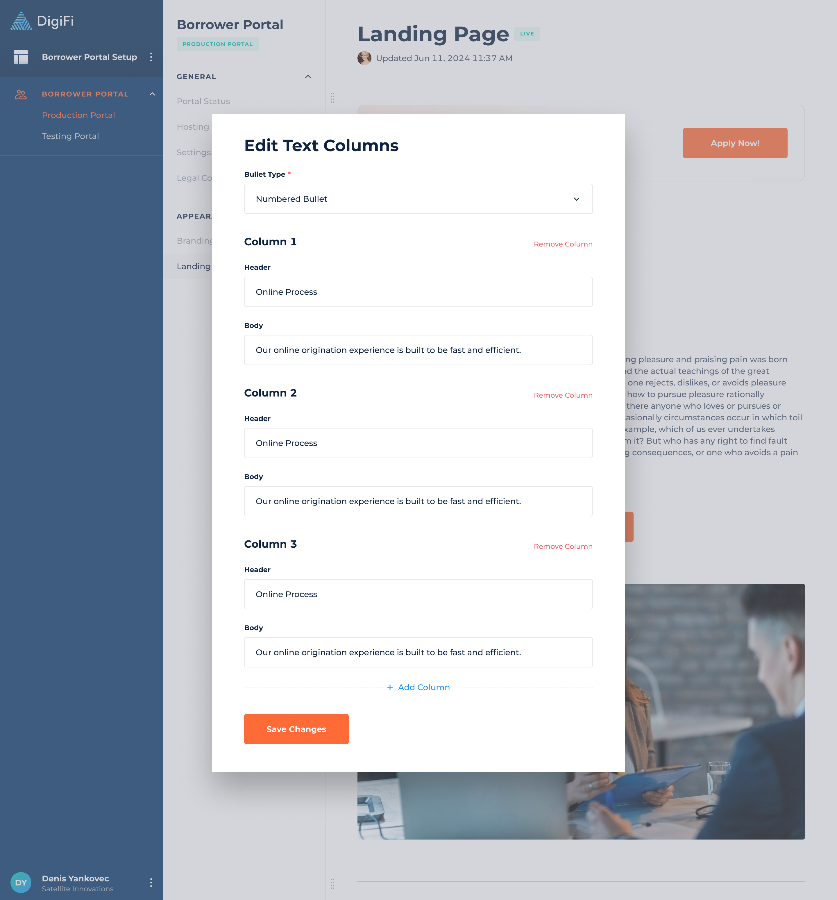
Text Columns
The Text Columns are customizable fields where users can input and display textual information related to loans, borrowers, or other relevant data. The maximum number of text columns allowed is 5.
The text columns include the following configurations:
- Bullet Type, which allows you to select the type of bullet (or no bullet) to display with text columns.
- Header, which is the main title or heading of the column.
- Body, which is the main content or paragraph of the column.
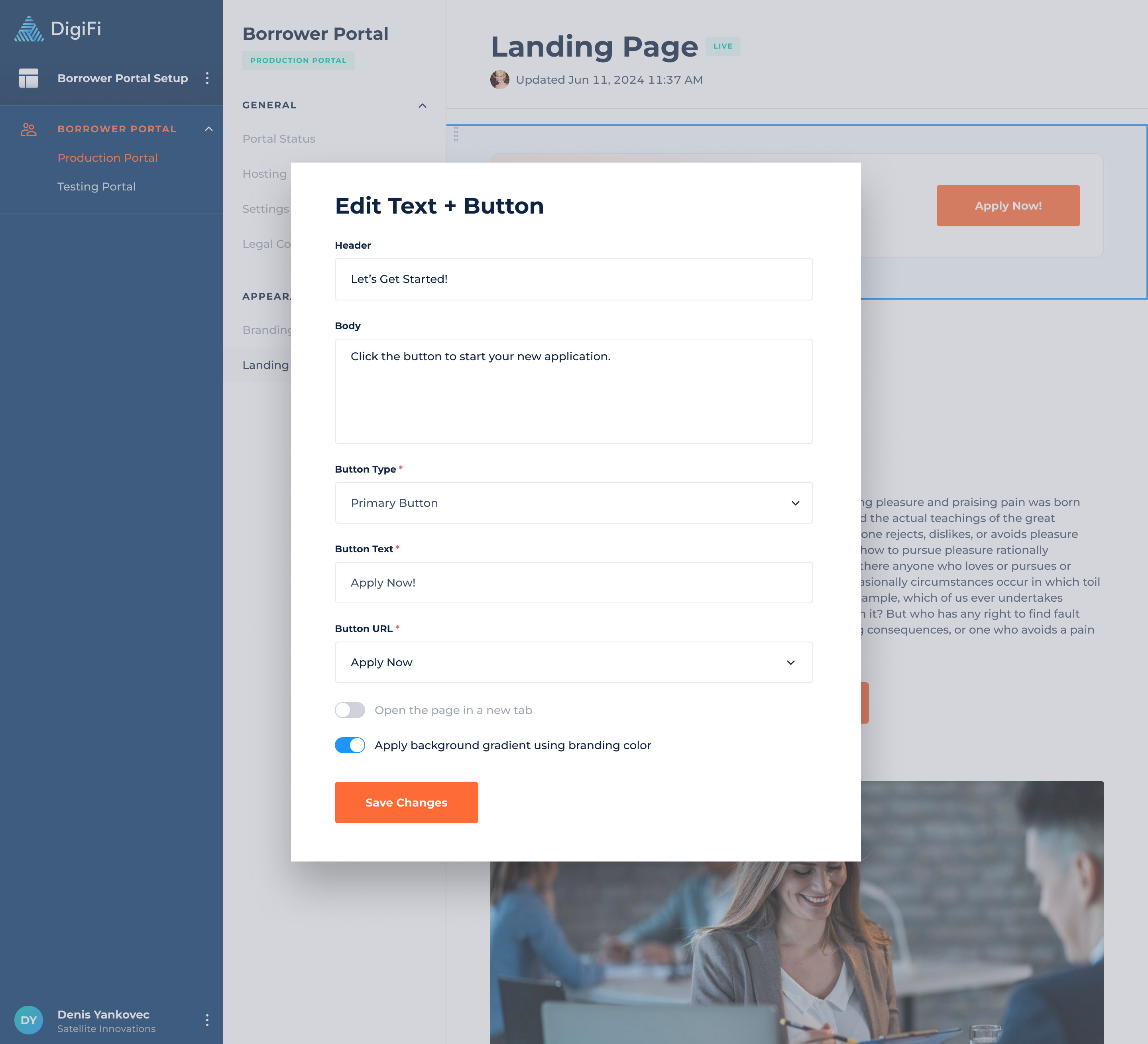
Text + Button
The Text + Button element consists of action-oriented text paired with a button that executes the action. For example, the text might say "Click the button to start your application," and clicking the button initiates the application process.
The text + button include the following configurations:
- Header, which is the main title or heading of the element.
- Body, which is the main content or paragraph of the element.
- Button Type (Primary, Secondary), which defines the visual style of the button on the element.
- Button Text, which represents text within the button.
- Button URL (Apply Now, Sign In, Create Account, Custom), which allows you to define where the borrower will be redirected after clicking the button.
- Custom URL, if selected, allows you to specify the URL to which the borrower will be redirected.
Optionally, you can enable a background gradient using your branding colors to make the element more visually appealing to borrowers.
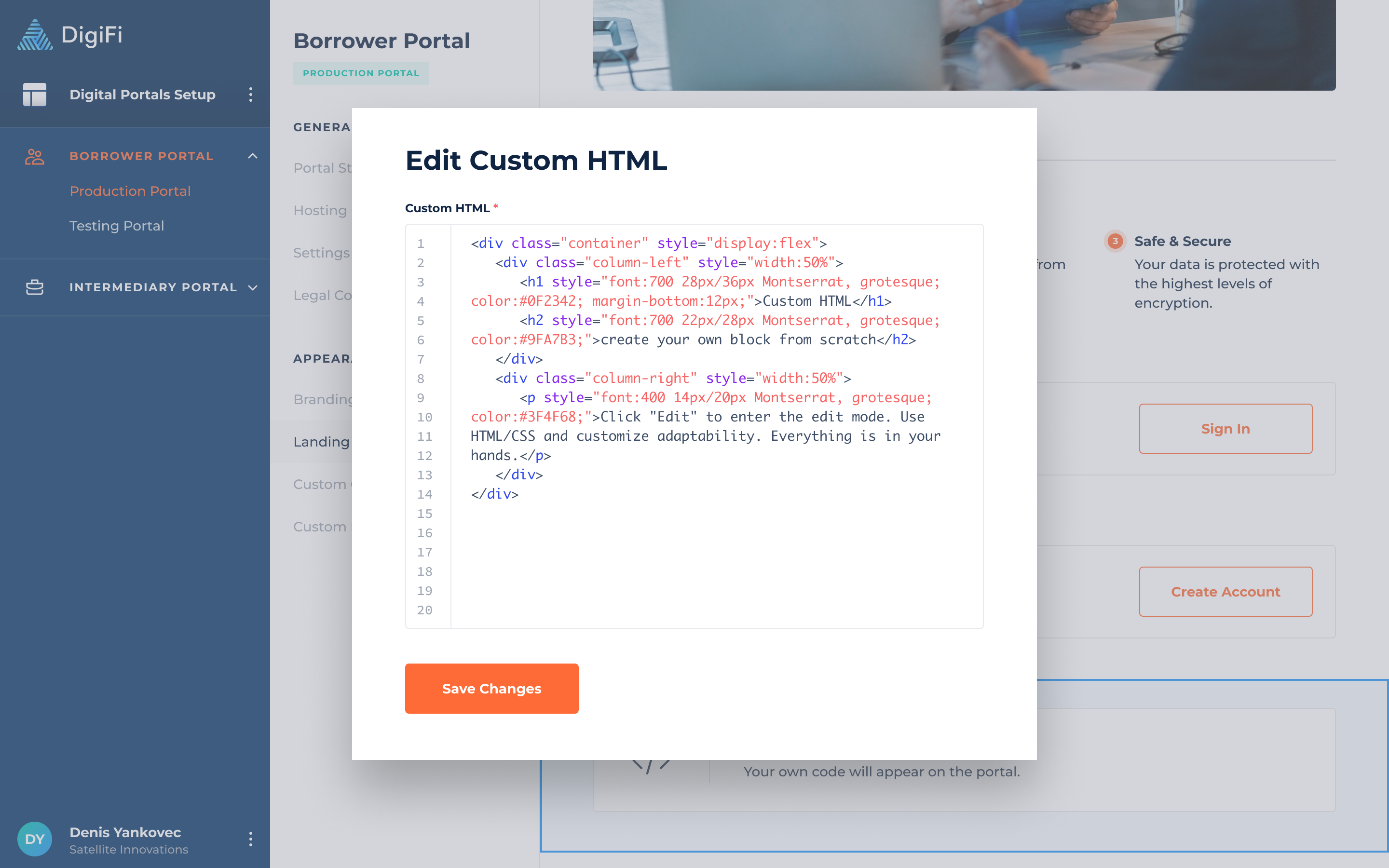
Custom HTML
The Custom HTML element allows you to add custom HTML blocks to portal pages, giving you flexibility and creative control to integrate personalized content. For example, you can create a two-column layout with text, apply different colors, and customize styles to match your needs.
Updated 10 months ago